Another challenge participation right down to the wire.
Layout from Sketch Saturday (which means I've succeeded in my aim to try and participate in every challenge I'm noted that down that closed in the last seven days! Mad, but true), palette from Color Throwdown (Fired Brick, Spiced Marmalade, Mustard Seed, Faded Jeans distress; Cobalt Archival) for whom I'm honoured to have been Featured Stamper this week, and daunted to be a guest star stamper next week, stamp inspiration from Uniko, and last but not least Shopping our Stash.
At SOS this week the challenge was to use your oldest washi tape, which is something I confess I've never bought, so I used one of the linked pages to create my own - great, messy fun. You may be able to 'just' see the self-coloured floral stamping on top of the colour wash.
Both flower stamps - cat and flowers are from Clarity. I think a cat composed all of flowers is rather cool.
Sketch Saturday #360
Uniko Studio #21 - Flowers
Color Throwdown #342 - Red, Orange, Yellow, Blue
Shopping our Stash #201 - Oldest (or faux) Washi Tape
Friday, 15 May 2015
Fishy Birthday
This week's it's a one layer challenge at 'Less is More', and once I stopped trying to wriggle out of it, it gave the opportunity to try something I've wanted to do for ages. Which is to take a one layer challenge, combine it with a (layered) sketch challenge, and create a faux layered card.
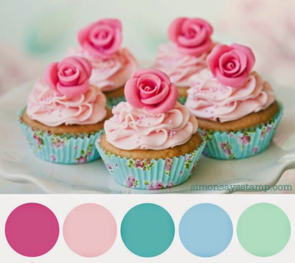
A nice simple layout at Tuesday Morning Sketches obliged, along with the pretty palette at Simon Says Wednesday (I used Spun Sugar, Picked Raspberry and Shabby Shutters distress, with Cloudy Blue and Stream Adirondacks). Last but not least, this is about as grungy as I get: hand drawn lines, mottled hand sponging, and the old 'watery' brayer technique (ink up, roll over scrunched up paper, roll on - hey presto).
The fish and word chain stamps are from Clarity, and I also used their banner and Jo's bubbles stencil to achieve this effect.
Simon Says Wednesday - Colour Swatch
Less is More #223 - One layer: Water
Tuesday Morning Sketches: #300
Time Out Challenges #31 : Grunge with the optional twist of embossing (I chose not to take the twist)
A nice simple layout at Tuesday Morning Sketches obliged, along with the pretty palette at Simon Says Wednesday (I used Spun Sugar, Picked Raspberry and Shabby Shutters distress, with Cloudy Blue and Stream Adirondacks). Last but not least, this is about as grungy as I get: hand drawn lines, mottled hand sponging, and the old 'watery' brayer technique (ink up, roll over scrunched up paper, roll on - hey presto).
The fish and word chain stamps are from Clarity, and I also used their banner and Jo's bubbles stencil to achieve this effect.
Simon Says Wednesday - Colour Swatch
Less is More #223 - One layer: Water
Tuesday Morning Sketches: #300
Time Out Challenges #31 : Grunge with the optional twist of embossing (I chose not to take the twist)
Wednesday, 13 May 2015
Special Robin
You may be relieved to hear this is my last treatise to Tangerine.
CAS Colours and Sketches presented with a pretty grey/brown/orange palette. Hmmm... Didn't want to skimp on my series, and so I started skimming through my files of stamps - paper pieced dress - yep, that would work, Robin - hey, hang on a minute, Robin - genius. Even more fortuitously I had this piece half done in a stack of 'to finish later' bits and bobs. He just needed colouring (distress inks - vintage photo, ripe persimmon, pumice stone) and mounting - ta dah.
My other mission today was CAS, some of the cards I've done recently have felt quite fussy, for me. So CAS it is, and the opportunity to feel I'm properly playing by the rules at Addicted to CAS, Addicted to Stamps and CAS on Sunday.
CAS Colours and Sketches #123 Colours (Soft Suede, Tangerine Tango, Soft Suede)
Addicted to CAS #63: Birds
Addicted to Stamps and More #144: CAS
CAS On Sunday #58: Cheer up Buttercup (If I was feeling a bit blue, I'd be honoured to receive a bright cheery card like this)
CAS Colours and Sketches presented with a pretty grey/brown/orange palette. Hmmm... Didn't want to skimp on my series, and so I started skimming through my files of stamps - paper pieced dress - yep, that would work, Robin - hey, hang on a minute, Robin - genius. Even more fortuitously I had this piece half done in a stack of 'to finish later' bits and bobs. He just needed colouring (distress inks - vintage photo, ripe persimmon, pumice stone) and mounting - ta dah.
My other mission today was CAS, some of the cards I've done recently have felt quite fussy, for me. So CAS it is, and the opportunity to feel I'm properly playing by the rules at Addicted to CAS, Addicted to Stamps and CAS on Sunday.
CAS Colours and Sketches #123 Colours (Soft Suede, Tangerine Tango, Soft Suede)
Addicted to CAS #63: Birds
Addicted to Stamps and More #144: CAS
CAS On Sunday #58: Cheer up Buttercup (If I was feeling a bit blue, I'd be honoured to receive a bright cheery card like this)
Wonderful Mum
Inspiration came from Time Out for this one, the colours and the leafy background. Mother's Day is come and gone here in the UK, but this is the sort of card that I'd make.
Background is a Clarity stencil inked and passed through my Grand Calibur (which I think might be on its way to being bust) with a mask in the middle. Gently inked through the stencil with brushes and then a bright Clarity stamp in the centre.
I drew out the grey leaf pattern, the subtle leaf greens, a bit of 'Caramel' shading and the bright pink and turquoise for the flower.
Time Out Challenge #30 - Home Sweet Home inspiration photo
Friday Mashup #208 - Recycled/Upcycled and/or Mother's Day (I chose the latter!)
Background is a Clarity stencil inked and passed through my Grand Calibur (which I think might be on its way to being bust) with a mask in the middle. Gently inked through the stencil with brushes and then a bright Clarity stamp in the centre.
I drew out the grey leaf pattern, the subtle leaf greens, a bit of 'Caramel' shading and the bright pink and turquoise for the flower.
Time Out Challenge #30 - Home Sweet Home inspiration photo
Friday Mashup #208 - Recycled/Upcycled and/or Mother's Day (I chose the latter!)
Tuesday, 12 May 2015
Flutterby Friends
One last peachy pleasure for today! By my count there's one more tangerine treasure to come, to complete the series.
An eclectic selection of colours from ColourQ, paired with a Retro Sketch and throwing in Allsorts die cuts challenge for good measure!
Colour Q #290 - Calypso Coral, Coastal Cabana, Blushing Bride, Poppy Red, White
Retro Sketches #164
Allsorts - Die Cuts, more than two (I count six)
An eclectic selection of colours from ColourQ, paired with a Retro Sketch and throwing in Allsorts die cuts challenge for good measure!
Colour Q #290 - Calypso Coral, Coastal Cabana, Blushing Bride, Poppy Red, White
Retro Sketches #164
Allsorts - Die Cuts, more than two (I count six)
Monday, 11 May 2015
Lily of the Valley
Continuing my tangerine theme, a hint of pink in a simple CAS tribute to the Lily of the Valley.
I'd been pondering on the unusual colour combination at Color Throwdown ever since it came out. I was all resolved to go to bed and forget about it; then I saw a new Lily of the Valley stamp abandoned on my coffee table, in combination with CAS(E) this sketch and Sweet Stampin's 'Spring Flowers' inspiration had struck.
Color Throwdown - Light Pink, Orange, Light Green, Yellow
CAS(E) this Sketch #122
Sweet Stampin' - Spring Flowers

I'd been pondering on the unusual colour combination at Color Throwdown ever since it came out. I was all resolved to go to bed and forget about it; then I saw a new Lily of the Valley stamp abandoned on my coffee table, in combination with CAS(E) this sketch and Sweet Stampin's 'Spring Flowers' inspiration had struck.
Color Throwdown - Light Pink, Orange, Light Green, Yellow
CAS(E) this Sketch #122
Sweet Stampin' - Spring Flowers

WOW Christmas
After all yesterday's coral (and I'm not finished with those tones yet!) here's a bit of late-breaking White on White for a stark contrast.
I like being prepared for Christmas early, and follow Tis the Season for this reason. I've spent the last week and more mulling over their latest challenge - White on White, and an inspiration photo, from which I took the stars shape and silver accent. A holiday card fits nicely over at Addicted to Stamps and More and with the focus being on shape and texture rather than colour for me it fits the brief over at Casology as well.
The stars are grunge paste pulled through a Clarity stencil, sprinkled with a white/tinsel embossing powder whilst still wet, and then set, plus an appropriate sentiment to finish it all off.
Photographs atrociously, but I hope you get the idea.
Tis' the Season #41 - White on White inspiration photo
Casology #145 - Shape
Addicted to Stamps and More #143 - Holiday
I like being prepared for Christmas early, and follow Tis the Season for this reason. I've spent the last week and more mulling over their latest challenge - White on White, and an inspiration photo, from which I took the stars shape and silver accent. A holiday card fits nicely over at Addicted to Stamps and More and with the focus being on shape and texture rather than colour for me it fits the brief over at Casology as well.
The stars are grunge paste pulled through a Clarity stencil, sprinkled with a white/tinsel embossing powder whilst still wet, and then set, plus an appropriate sentiment to finish it all off.
Photographs atrociously, but I hope you get the idea.
Tis' the Season #41 - White on White inspiration photo
Casology #145 - Shape
Addicted to Stamps and More #143 - Holiday
Subscribe to:
Posts (Atom)